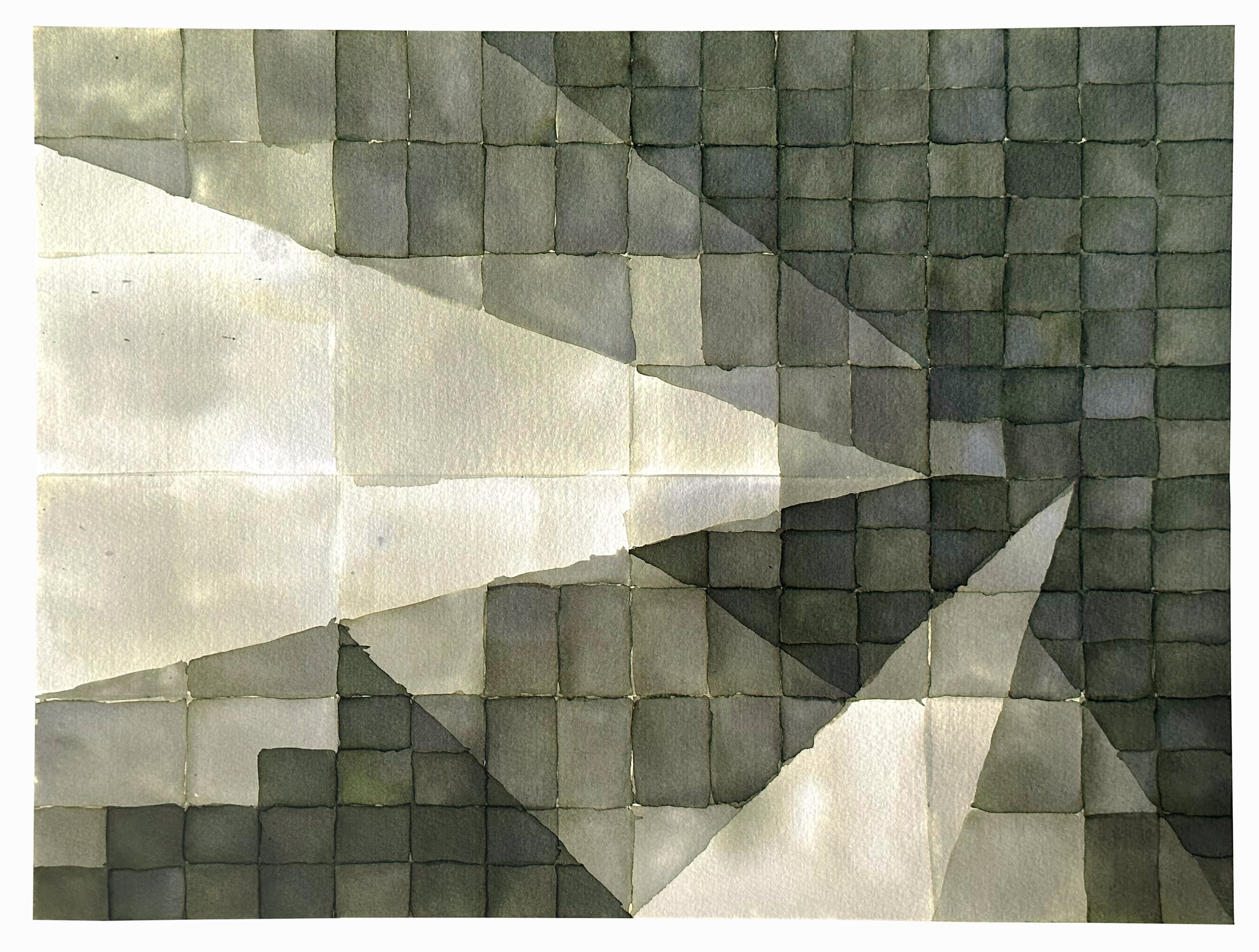
Slippery Geometry, Sub-Series G–III
fountain pen ink on paper, 16x12
2024

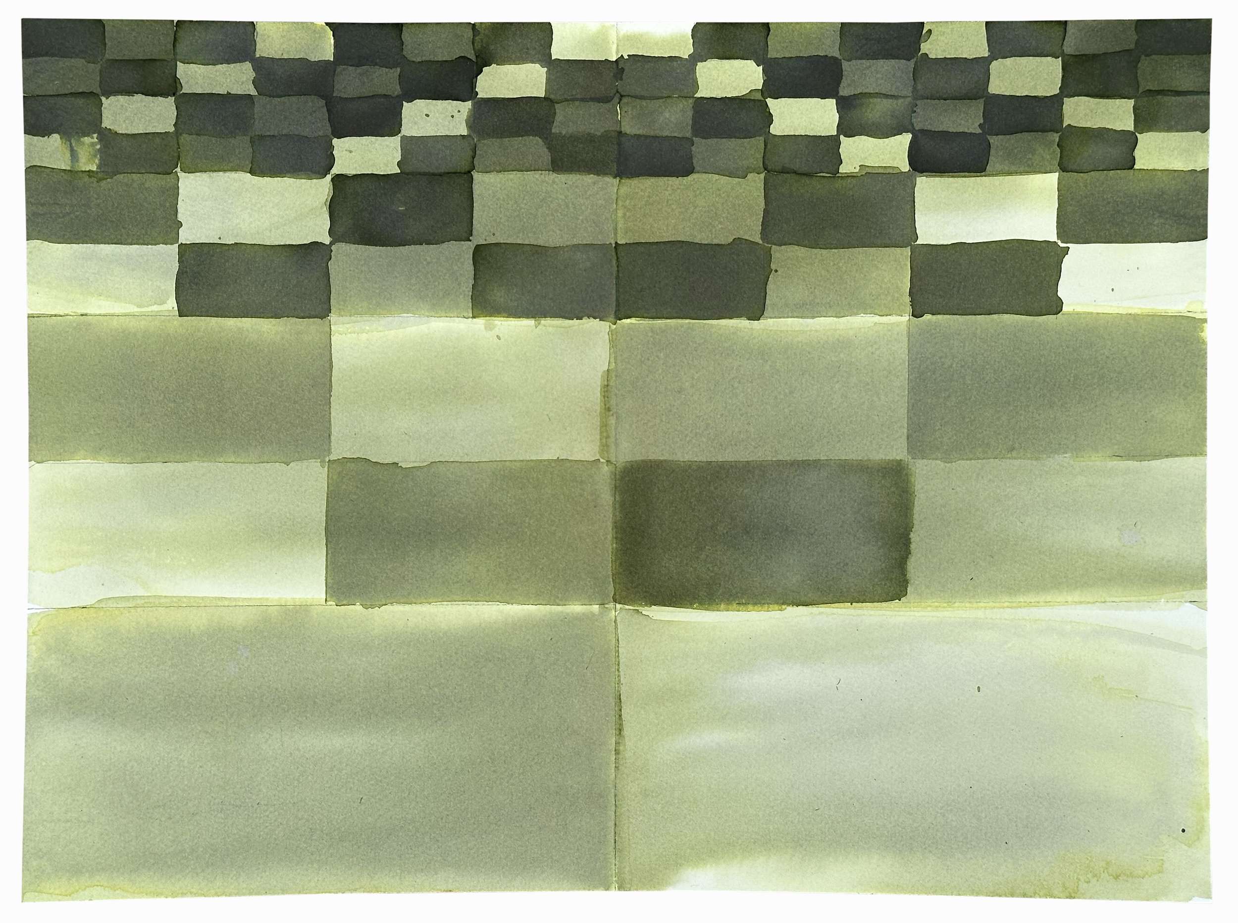
Slippery Geometry, Series D–VII
opalescent fountain pen ink on paper, 22x30
2024

Slippery Geometry, Sub-Series G–II
fountain pen ink on paper, 16x12
2024

Slippery Geometry, Sub-Series G–I
fountain pen ink on paper, 16x12
2023

Slippery Geometry, Series C–IX
fountain pen ink on paper, 22x30
2023

Slippery Geometry, Series F–III
fountain pen ink on paper, 22x30
2023

Slippery Geometry, Sub-Series E–I
opalescent fountain pen ink on paper, 16x12
2023

Slippery Geometry, Sub-Series C–III
fountain pen ink on paper, 16x12
2023
Slippery Geometry, Sub-Series C–II
fountain pen ink on paper, 16x12
2023

Slippery Geometry, Series F–II
fountain pen ink on paper, 22x30
2023

Slippery Geometry, Sub-Series C–I
fountain pen ink on paper, 16x12
2023
Slippery Geometry, Series C–VIII
fountain pen ink on paper, 22x30
2023

Slippery Geometry, Series D–VI
opalescent fountain pen ink on paper, 22x30
2023
SOLD

Slippery Geometry, Series D–IV
opalescent fountain pen ink on paper, 22x30
2022

Slippery Geometry, Series C–V
fountain pen ink on paper, 22x30
2022

Slippery Geometry, as a whole, has a language—but each series has its own expression or dialect. Sometimes, often with the first of a new series, I am overtly trying to expand the vocabulary, or at least grasp how this new material fits into it. Other times, like here, I feel like the piece is trying expand the vocabulary and I’m just trying to understand how. I don’t always meet those demands but the effort is an interesting exercise unto itself.
Slippery Geometry, Series E–I
opalescent fountain pen ink on paper, 22x30
2022

Slippery Geometry, Series D–III
opalescent fountain pen ink on paper, 22x30
2022

Slippery Geometry, Series D–II
opalescent fountain pen ink on paper, 22x30
2021-2

Slippery Geometry, Series C–IV
fountain pen ink on paper, 22x30
2021

Slippery Geometry, Series D–I
opalescent fountain pen ink on paper, 22x30
2021

For this series, I turned again to Birmingham Pen Co. I set out to work with this metallic-paynes-gray. I thought it would be interesting to have the higher contrast between paper and ink, but ironically where the ink was densest, the metallic elements gathered more making it reflective instead of black-ish. Given how quickly this color accumulates, I had to go for a more spacious, composition, but in that wanted to take the opportunity to let the ink really spread in pools of water.