Slippery Geometry, Series D–V
opalescent fountain pen ink on paper, 22x30
2022

Slippery Geometry, Series C–VI
fountain pen ink on paper, 22x30
2022

Slippery Geometry, Series D–IV
opalescent fountain pen ink on paper, 22x30
2022

Slippery Geometry, Series E–II
opalescent fountain pen ink on paper, 22x30
2022

Slippery Geometry, Series C–V
fountain pen ink on paper, 22x30
2022

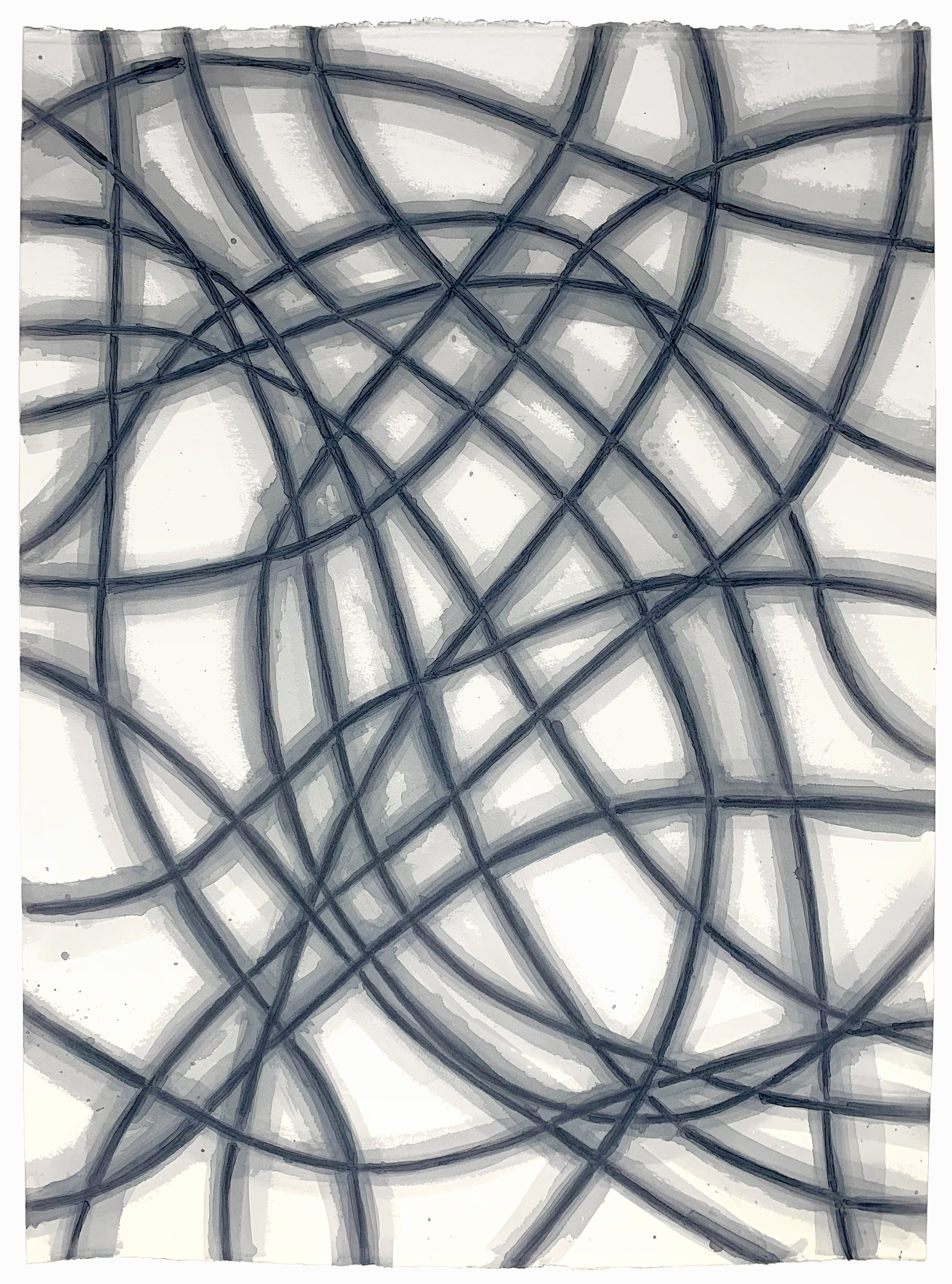
Slippery Geometry, as a whole, has a language—but each series has its own expression or dialect. Sometimes, often with the first of a new series, I am overtly trying to expand the vocabulary, or at least grasp how this new material fits into it. Other times, like here, I feel like the piece is trying expand the vocabulary and I’m just trying to understand how. I don’t always meet those demands but the effort is an interesting exercise unto itself.
Slippery Geometry, Series E–I
opalescent fountain pen ink on paper, 22x30
2022

Slippery Geometry, Series D–III
opalescent fountain pen ink on paper, 22x30
2022

Slippery Geometry, Series D–II
opalescent fountain pen ink on paper, 22x30
2021-2

Slippery Geometry, Series C–IV
fountain pen ink on paper, 22x30
2021

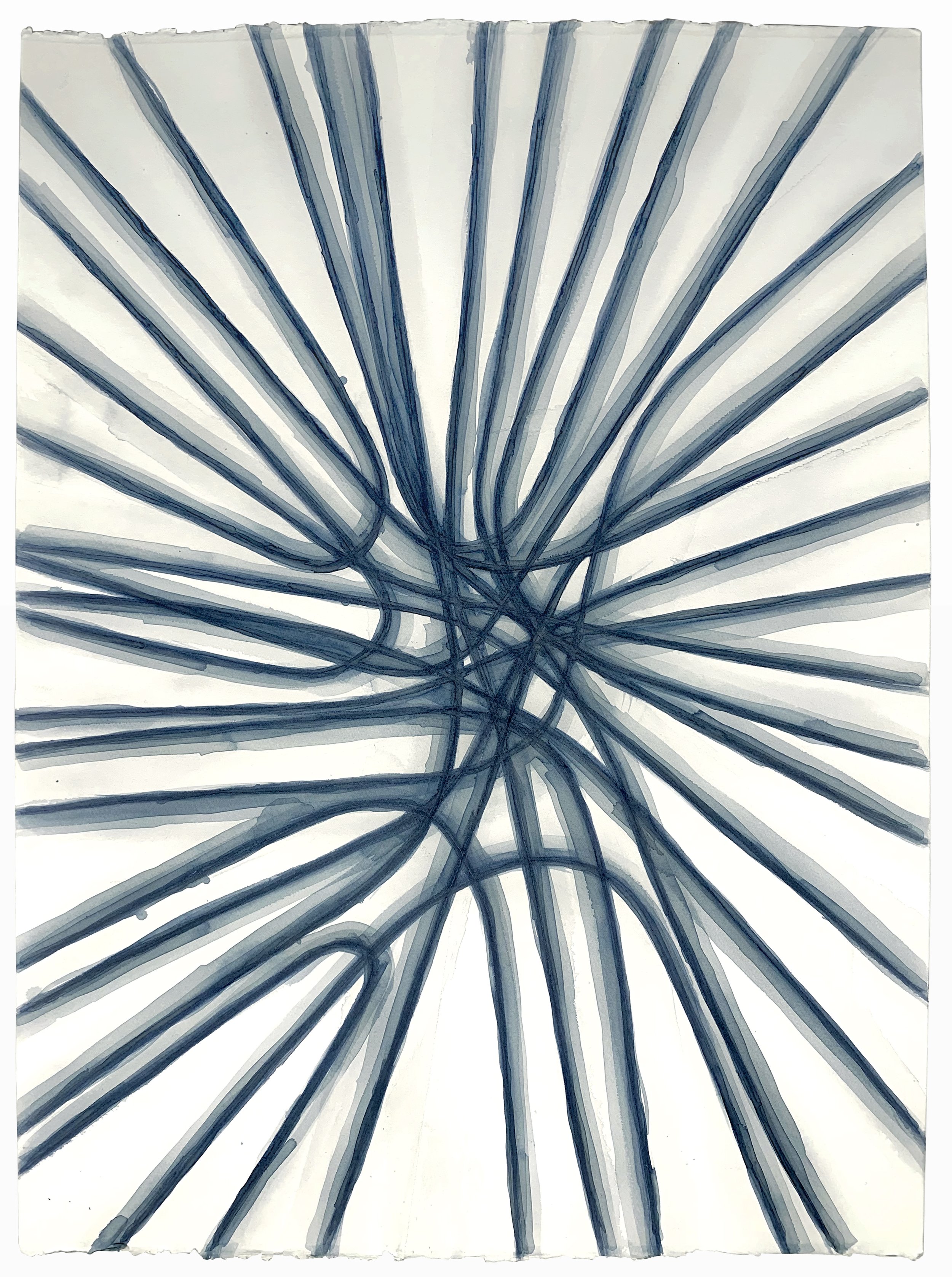
Slippery Geometry, Series D–I
opalescent fountain pen ink on paper, 22x30
2021

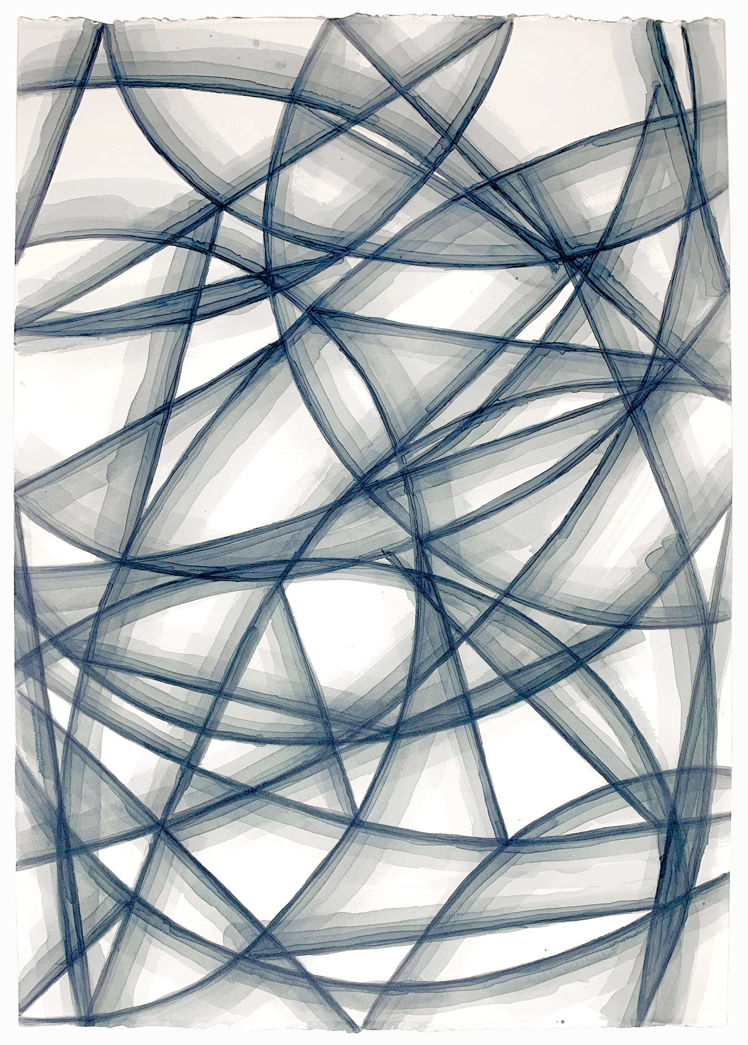
For this series, I turned again to Birmingham Pen Co. I set out to work with this metallic-paynes-gray. I thought it would be interesting to have the higher contrast between paper and ink, but ironically where the ink was densest, the metallic elements gathered more making it reflective instead of black-ish. Given how quickly this color accumulates, I had to go for a more spacious, composition, but in that wanted to take the opportunity to let the ink really spread in pools of water.
Slippery Geometry, Series C–III
fountain pen ink on paper, 22x30
2021

Slippery Geometry, Series C–II
fountain pen ink on paper, 22x30
2021

Slippery Geometry, Series C–I
fountain pen ink on paper, 22x30
2021

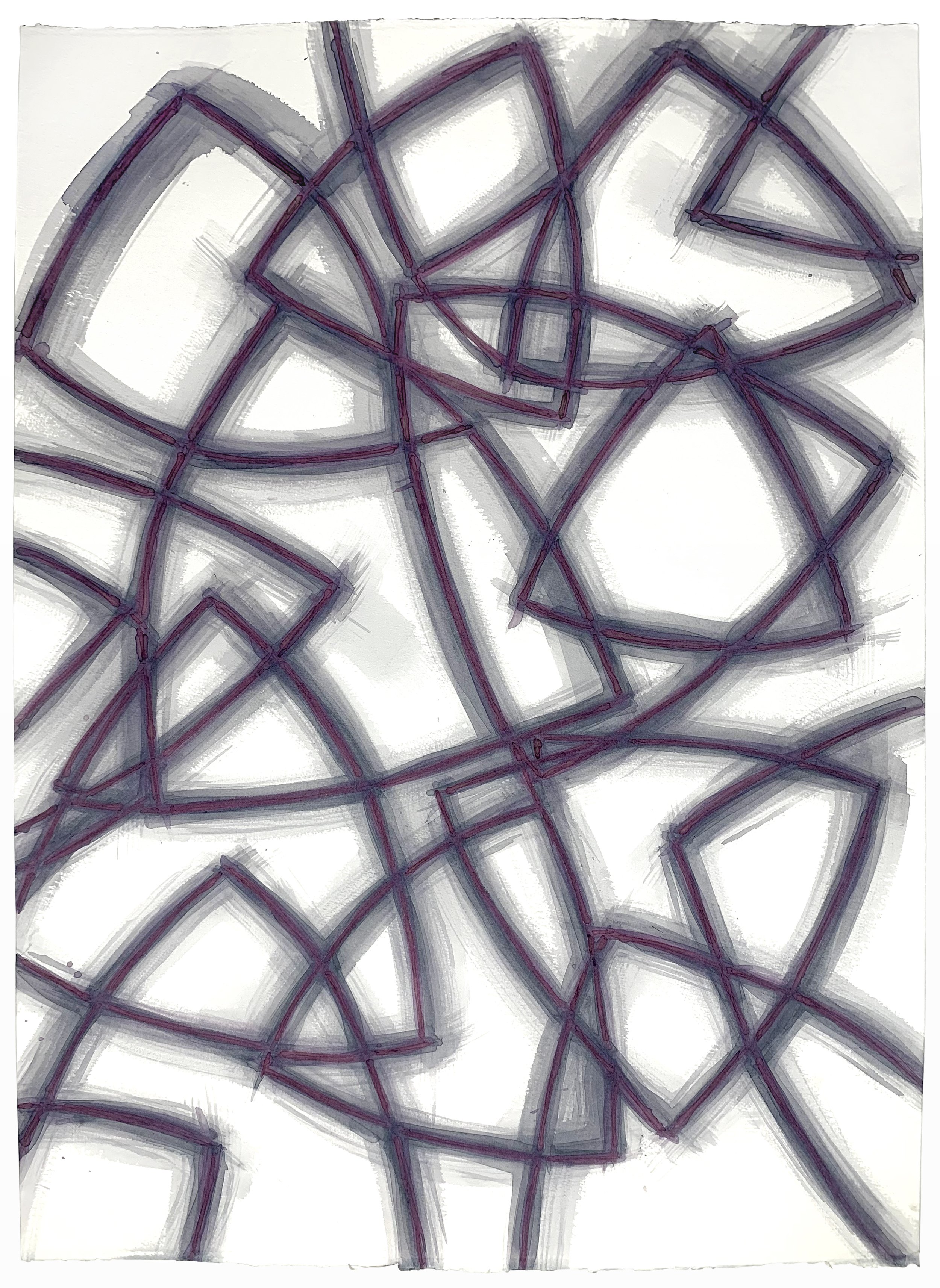
Thanks to an instragram ad (no shame), I discovered the lovely Birmingham Pen Co. They offer some truly finely crafted, water-soluble inks. Even if they are ‘intended’ for fountain pens, I’ve found them lovely to work with. I have been rather obsessed with this mossy green color they call, Arugula. In fact, I was so entranced with the hue I decided that Series C, using that ink would be distinguish itself with repeated patterns with virtually no negative space to speak of.
Slippery Geometry, Series B–V
homemade black carrot ink on paper, 22x30
2021
Slippery Geometry, Series B–IV
homemade black carrot ink on paper, 22x30
2021
Slippery Geometry, Series B–III
homemade black carrot ink on paper, 22x30
2021
Slippery Geometry, Series B–II
homemade black carrot ink on paper, 22x30
2021
SOLD
Slippery Geometry, Series B–I
homemade black carrot ink on paper, 22x30
2021
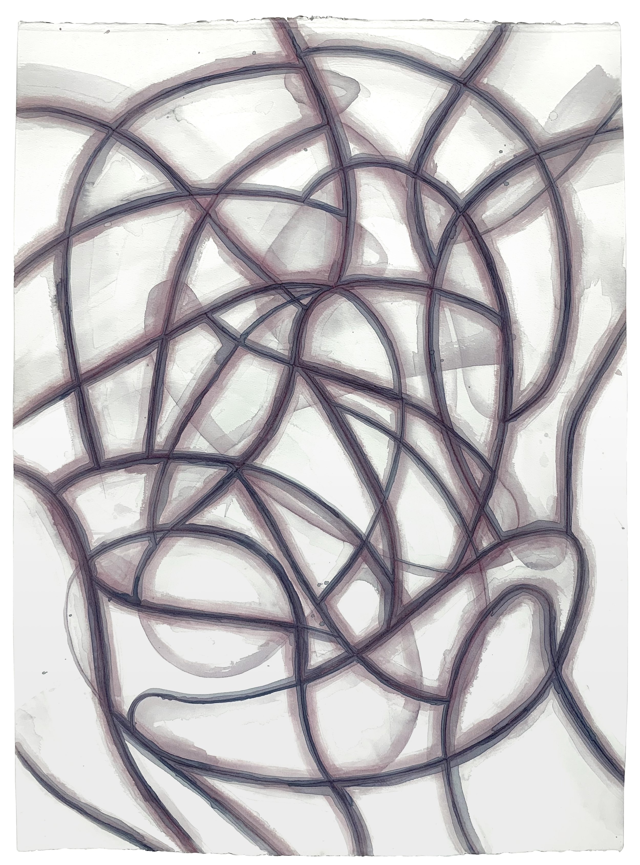
On something of a whim, I made a foray into homemade ink. I had an unexpected harvest of black nebula carrots—more than I could reasonably eat. Furthermore, I realized they stained surfaces worse than beets. So with a minimum of online guidance I took a stab at making ink.
Armed with two bottles, I set out to try a new branch of the Slippery Geometry series. Having tried and failed before to introduce the odd circle to the rigid lines of Series A, I decided to give this new branch it’s own character by instead focusing exclusively on curved lines.
The two bottles painted differently, and have aged differently. They both painted bright magenta, but the first quickly aged to a deep indigo. The first half of the second bottle has thus far remained purplish, but the more I ussesd it, the more it faded to a pale gray.
In the long run, I can’t say how these works will age: perhaps they are what they will be or maybe they will all fade to gray eventually. As I have read, working with homemade inks necessitates embracing those changes.
Slippery Geometry, Series A–X
walnut ink on paper, 22x30
2021

Slippery Geometry, Series A–IX
walnut ink on paper, 22x30
2021
